Abandoned carts are lost sales since users were interested in buying a product.. 8 in 10 online shoppers abandon their carts. And, do you know why?
Well, there are many reasons like hidden costs, limited payment options, compulsory logins, or maybe security concerns. Unfortunately, it becomes impossible for eCommerce business owners to know what spooked shoppers.
“So how do we bring this dramatic cart abandonment rate down?” you may ask. The simple answer is that an impeccable checkout page will do the trick. However, that’s much easier said than done. You need to bring forth the right balance of convenience, security, and functionality to create the perfect checkout page.
Editor’s note: For reducing abandoned cart rates, your primary focus should be on finding pain points and optimizing them thoroughly. If you want to build it from scratch or optimize it, explore Simform’s eCommerce development services to get started with checkout page optimization.
Checkout is inarguably the most crucial stage of a customer’s journey. It is here that all your efforts come to fruition. It all boils down to whether you can get the customer past this threshold. On the one side, you’re successfully making a sale. But on the other side, there’s a steep abandonment of cart.
Checkout Page Optimization Tips
This article gives you the best checkout page optimization strategies. It addresses all the critical facets, such as design, convenience, payment, and security. Once you master these elements, you’ll have a high converting checkout page at your disposal. So let’s jump right into it.
Design
There is plenty more to design than just the aesthetics. Right from the placement of form fields to the colors of CTA buttons, everything falls under the umbrella of an eCommerce checkout page design. A well-thought-out design would make the process frictionless and motivate shoppers to make a purchase. Thus, it becomes imperative to design the page around the checkout process and not the other way around. Here are a few helpful tips:
1. Simplify Design
It’s easy to get caught up in the bid to create stunning designs and templates. But that’s no use if the checkout page UI isn’t good at conversions. Create simple designs that don’t intimidate shoppers.
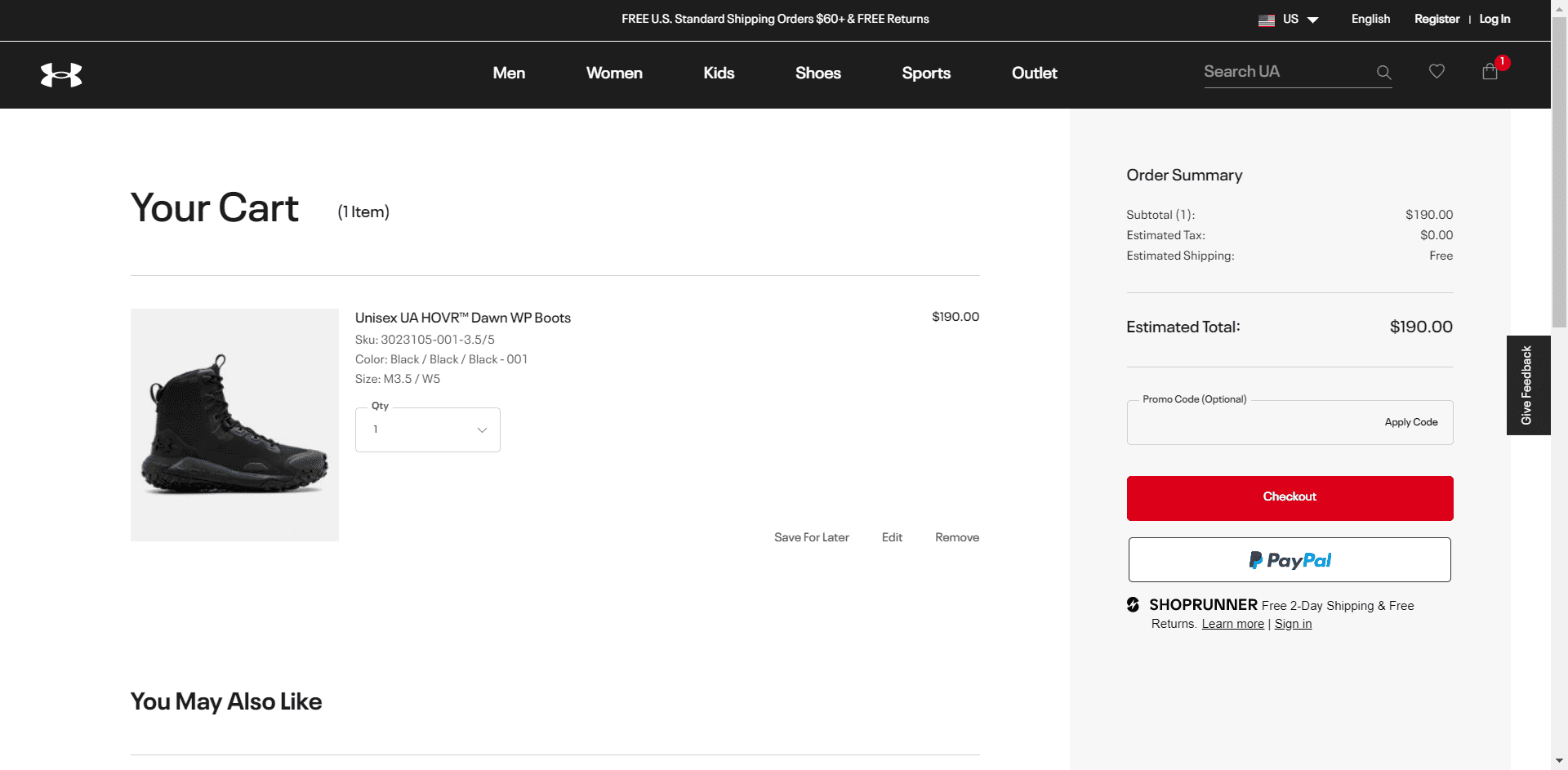 Under Armour’s checkout page, for example, has a clean and elegant design that makes the shopper want to buy the product.
It’s only natural that you want a variety of design elements to reflect on your checkout screen, but, trust us, you wouldn’t want that. Instead, focus on what’s important, and highlight the same. Notice how Under Armour uses ample of white space to draw a user’s attention to specific sections and navigate them to CTAs. So, when you sit down to create or improve the checkout page for your eCommerce website, make sure you keep things simple.
2. Remove Distractions
It takes just one misplaced design element to distract shoppers from their primary goal. Distractions like last minute offers, advertisement pop-ups, product recommendations, unwanted graphics among others allow the shopper’s mind to wander off into other directions. This increases the possibility of abandoning the shopping cart without completing the checkout process.
Our pro tip is to get rid of the usual header, footer, and menu options from the checkout page and make it a blinker for the process.
Another damaging yet common distraction for shoppers is an unnecessarily long process. This one didn’t occur to you, did it? Well, now you know it. Keep it short, and include just the required fields. Bring the finishing line closer, and it’ll be easier to motivate customers to go through with the purchase.
3. Ignite Emotions
In an ideal scenario, the customer is highly driven to buy the product. And therefore, it’s almost certain they will complete the checkout process. But how to make this ideal situation a reality? Use emotions!
You can induce FOMO (Fear Of Missing Out) by showing the number of remaining units or perhaps you can show them how much you care through customer loyalty programs. Highlight the added benefits of buying the product, and the shopper would be more driven than ever.
4. Use Single-Page Checkouts
One-page checkouts have become quite popular lately, and rightly so. They speed up the checkout process and improve the overall conversion rate. Baymard’s research suggests that 21% of shoppers abandon carts because of a long and complicated process.
Create a one-page checkout to give customers a path of least resistance. However, avoid filling the checkout page with too much information, for it will only lead to a higher cart abandonment rate. It’s also important for you to know that a one-page checkout form is not for every eCommerce business. We recommend you conduct A/B testing to determine if it’ll work for you.
WooCommerce one page checkout and Shopify customize checkout page are some of the easier ways to employ a single-page checkout on eCommerce websites.
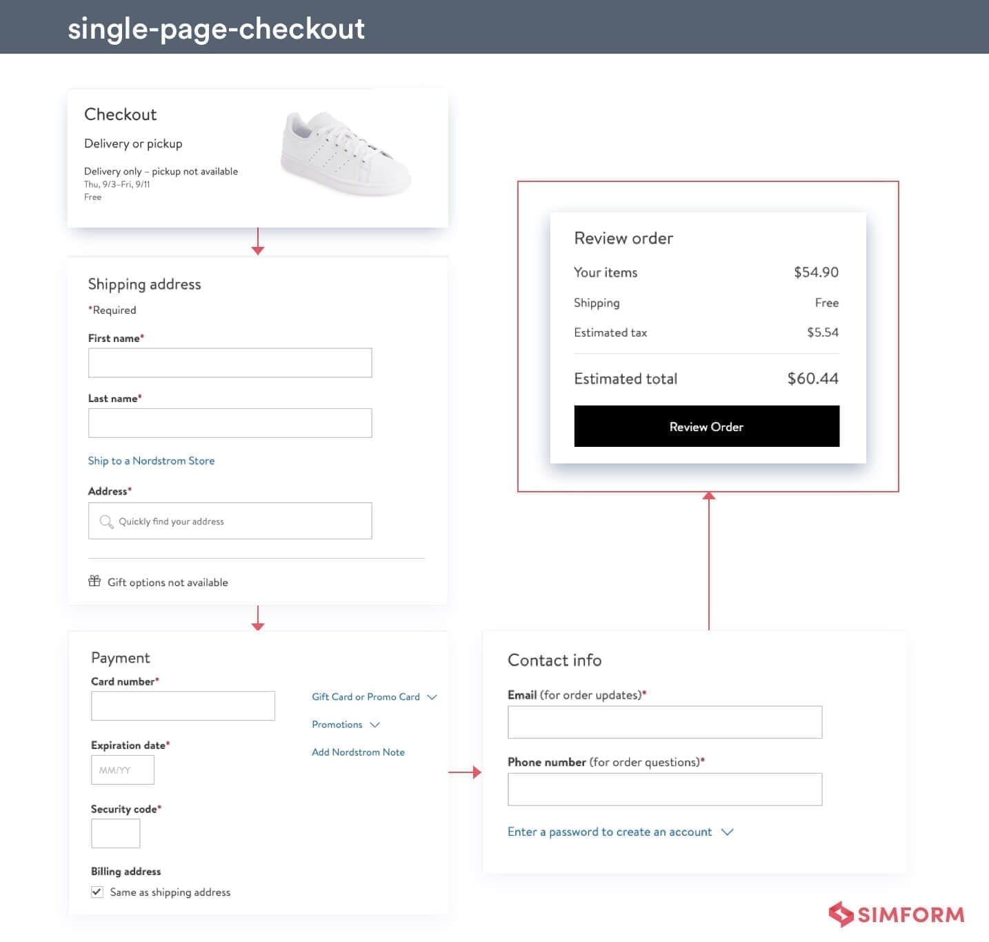 Nordstorm’s one-page checkout form is a good example to follow if you are looking for some good single-page checkout inspiration.
Single page checkouts are much simpler and convenient to implement over an headless eCommerce architecture. It eliminates the multiple reloads from the backend, and you get superior control over the page content.
5. Optimize For Mobile
By 2021, mCommerce will account for 72.9% of all eCommerce sales. But then mobile commerce also has the highest cart abandonment rate with 85.65% shoppers leaving the cart. It means that to properly reap the benefits of this enormous market share, you need to come up with an excellent checkout page for mobile devices.
A few guidelines you must follow are:
- Design the page for single-handed operations.
- Don’t create a lengthy checkout page. Break the process into smaller stages instead.
- Keep the CTA buttons big enough to avoid accidental taps.
- Keep the font and form fields large for better readability.
Some of the other factors that dictate the success of your mobile checkout page are whether it’s a native or hybrid app, and the kind CMS powering the application. These affect the responsiveness of the page, which in turn influences the user experience and ultimately the abandonment rate.
Convenience
“Take care of customers, and customers will take care of you.”
This has been the success mantra for top eCommerce businesses around the world. Convenience has become one of the most influential factors affecting the overall conversion rates. In fact, 83% of shoppers agree that they value convenience more compared to 5 years ago. So give shoppers what they want, even on the checkout page.
6. Allow Guest Checkout
Forced registrations are annoying and responsible for 28% of the cart abandonment instances. Shoppers associate it with an unwanted barrage of emails that follows. So don’t fret much about collecting email addresses and give shoppers some space.
With the guest checkout option, you are bound to improve the conversion rate. To get shoppers to subscribe to the store, you can always provide the registration option at the end of checkout.
Check how we build a Stubbs & Woottons luxury shoe brand go digital
7. Let Shoppers Sign-in with a Single Click
Account IDs and passwords have become an integral part of our digital lives. But no one likes the idea of remembering yet another password. You can have shoppers get rid of this burden by offering one-click sign-ins.
Let them use their social accounts such as Google and Facebook to register on your marketplace. The cross-platform functionality not only makes it a breeze for the shopper to login, but you also get access to some pre-vetted user info.
This can be done using OAuth2 along with an Identity and Access Management tool such as keycloak. The arrangement lets the third party authenticate users, and you get limited access to user accounts.
8. Provide Pre-filled Fields to Registered Users
This is a given. Registered customers should not need to enter the same info every time they buy something from your store. Filling delivery details is among some tedious tasks, especially when they are in the middle of a checkout process.
This feature adds convenience, speeds up the process, and leaves shoppers with less time to even think about abandoning the cart. A common practice for pre-filled fields is to store the user’s info in small packets. This way, the shopper has to select just one of the many saved delivery and payment options.
9. Show Progress Indicator
No matter how hard you try, it isn’t always possible to keep the checkout process short. Since we already know online dwellers are impatient beings, the question is “how to make sure they stick through the entire process?”. Put a progress indicator on the checkout page.
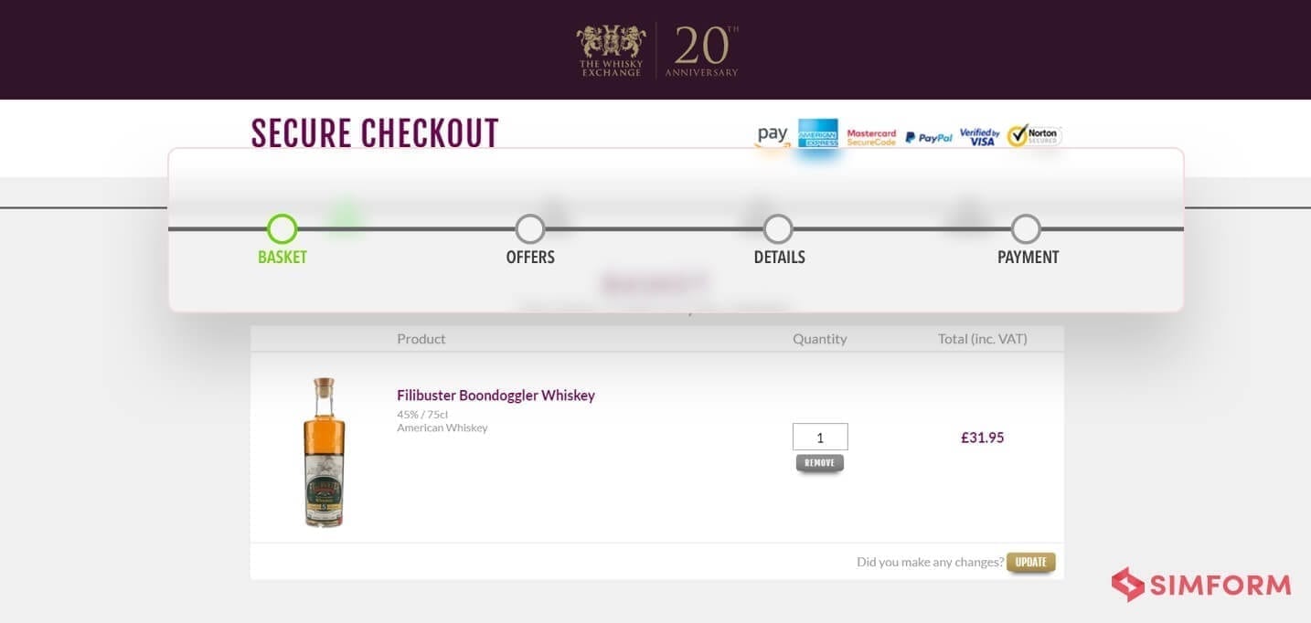
Source: Whisky Exchange
With a fair idea of how long the entire process might take, the customer will be mentally prepared to go through with it. Progress indicators work well for all kinds of checkout situations- be it on single-page checkout, on a mobile device, or for a registered customer. However, you should keep in mind to not limit the progress indicator to three to five stages.
10. Provide Checkout Buttons With Products
Shopping carts exist so that customers can buy multiple products and pay for all of them at once. But what about those who wish to buy just one product?
Add a “Buy Now” or “Go to Cart” option to directly take shoppers to the checkout page. This not only saves a lot of time but also reduces the effort taken to scan navigate to the final process. Moreover, now that Amazon’s patent over one-click checkout feature has expired, feel free to employ it to your product page.
11. Let them Save Cart in Wishlist
Sometimes shoppers use the cart as a glorified wishlist. However, they don’t often purchase all the cart products at once. In this case, they remove everything from the cart except the product they wish to purchase and proceed to checkout
But if there were an option of saving those other products in the cart for later, the customer might buy them eventually. Provide the option of saving cart items into the wishlist, and you might end up selling more to the customer in the long run.
Upselling isn’t advisable on the checkout page, but you can do it here in the wishlist section. You can deploy a recommendation engine which shows relevant products based on shopper’s preferences. You can easily generate more revenue with the additional AI and ML capabilities.
Custom Shopping Cart 101: How to Implement It in the Most Profitable Way
Payment
Second thoughts swoop in as soon as shoppers discover even the slightest irregularity in the payment module. It is why every eCommerce business needs to curate it’s payment section carefully. Let’s look at some of the strategies that can help you prevent those hasty retreats from the payment section.
12. Provide Multiple Payment Options
From credit cards to digital wallets and from COD to cryptocurrency, there is no dearth of payment options. Similarly, the preferred payment method varies from one customer to another. Some might like to use digital wallets for online payments while others prefer the good-old credit card transactions. The customer-centric approach dictates that you satisfy all these customers.
The eCommerce ecosystem is playing host to nearly 140 online payment methods. We don’t advocate using all of them, but the more the merrier. Find the more preferred payment methods of your target demographic, and then add some more to them.
API integration is the best way to include multiple payment modules to your eCommerce website. APIs from popular payment platforms such as Stripe and Paypal are readily available. Then there are APIs from platforms that specialize in specific kinds of payments such as crypto and credit cards. And for the API integration process, you can rely on our unparalleled services.
13. Steer Clear of Hidden Costs
18% of cart abandonment instances occur because customers can’t see the total cost upfront. Some businesses hide the extra cost and display it only at the very last minute. But such strategies turn out to be self-destructive for businesses.
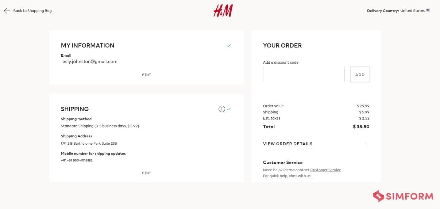 Source: H&M
Be upfront and transparent about every penny that you are going to charge. For instance, you might be able to nudge the customer to buy something extra to reach that free delivery threshold. And yes, the prerequisite to that would be to display the delivery charge right from the beginning.
14. Show Detailed Product Summary
It’s more than just the total cost that shoppers want to see before they go through with the purchase. They would like to know about the return policy, how long it will take for the product to be delivered, whether the product comes with extra perks, and loads of other information.
Make the product summary comprehensive so that shoppers can easily find all the relevant information. It goes without saying that this feature would elevate the conversion rate for the store.
15. Allow Order Modification
Order modification on the checkout page could prevent shoppers from leaving the checkout page. Although most online stores let shoppers change product quantity,you can go well beyond that.
Let them switch other variants, change the delivery address, and alter with other modifiable attributes. The more revision options on the checkout page, the less likely they will abandon the cart.
This seemingly basic feature is notoriously difficult to implement in an eCommerce app. The modified cart has a ripple effect throughout the database, affecting inventory and payment statuses. Even Shopify took a decade to roll out this feature for its customers.
16. Highlight Savings
Sometimes it’s not about how expensive the product is, but how much the shopper could save with a discount on the product. Thanks to the absence of middlemen, coupons, and offers from payment portals, online stores can bring down the cost of certain products to a great extent.
Tell shoppers how much you’ve helped them save. Show the original price and the difference between what the shopper is going to pay. It would let them know how profitable it is for them to buy items from you.
How to Make an eCommerce App
Trust and security
Once you win a shopper’s trust, it’s smooth sailing afterward. 17% of cart abandonments happen because of trust issues. So, it makes sense that you remind customers of all the reasons they should trust your brand. Here’s what you can do:
17. Show Security Badges and Trust Signals
Privacy and security breaches have created a lot of noise in the past couple of years. People have never been this cautious with their private and monetary info ever since they’ve found out that even the biggest organizations can end up leaking their precious data.
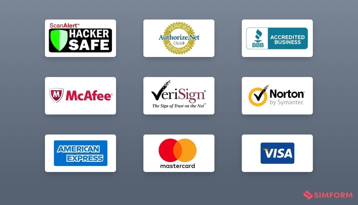 It’s up to you to showcase all the security measures employed in the store. Use security badges and trust seals on the checkout page. It will give users that extra ounce of confidence needed to trust your business and complete the checkout. It’s also critical that you use the right badges at the right place. For instance, the one showing secure payments should go into the payment section, while the one showing data safety should appear next to password fields.
And it’s not just about badges, put sincere effort towards security measures. Daily scans for SQL injection vulnerabilities, maintaining password hygiene, PCI compliance, and hashing user data are among the ways to strengthen security around the website. The more you do, the more there is to boast about it.
18. Implement Data Validation and Input Error Notifications
Data validation makes the entire checkout process more secure and smooths it out for shoppers. How so? Once you make it binding for only a specific kind of input, it drastically reduces the ability of conmen to meddle with it. Moreover, it prevents customers from making errors while filling those fields and saves them from further iterations of the process.
So, go ahead and set up validation rules for form fields. Mark out the necessary fields and display input errors if shoppers miss or enter incorrect information.
19. Bring Customer Support to Shoppers
It’s only natural for customers to have all kinds of questions right before buying the product. The best way to do so is to provide a live chat window on the checkout page. You don’t necessarily need to have a customer representative on the other side at all times. Deploy chatbots, they are now smarter than ever. Let them initiate assistance. And if that doesn’t suffice, the human representative can take over.
20. Show Reviews and Ratings
Word of mouth is the most convincing among all promotional techniques. It is why most eCommerce portals show customer reviews and ratings along with product descriptions. But you can take it a notch higher.
Display product ratings in the summary to give the customer yet another reason to buy the product. Showing reviews on the checkout page can be tricky, though. You can leave it altogether or somehow include a summarised version of reviews. But adding a link for reviews that takes shoppers to another page is nothing but a distraction.
21. Ask About Exit Intent
No matter how hard you work to counter them, cart abandonment instances are inevitable. But don’t let that demoralize you. Use exit-intent pop-ups to get an insight on why shoppers left your cart.
The data collected can unearth some neglected sections. You’d get to know straight from customers what improvements they wish to see in your online store, and you’ll know exactly what to do to improve the conversion rate.
Keep Testing, Keep Improving
There’s no one-size-fits-all solution for a perfect checkout page. It’s a perpetual process where you keep improving continuously because markets evolve and so do businesses. What’s working for you today, might be redundant tomorrow.
The most effective way to ensure you put out the best possible version of your checkout page is by continuous testing. We’d recommend not to blindly follow the tips and strategies you find on the internet. Consider their merits, test them out, and see if they bring about a positive change for your business.
Keep yourself Be prepared for a lot of A/B testing, and discover what works best for your eCommerce business. However, you also need to be smart while split testing the different versions. There should be a clear and identifiable difference between the different versions of the page. If the variants have many differences, you’d never know which specific feature is driving the change. So go ahead and try out these checkout page optimization techniques for your business.
Upgrade your ecommerce web app checkout page and reduce cart abandonment rate
Do you need professional help to improve your checkout page? From chatbots to an entire eCommerce website, Simform has answers to all your eCommerce development woes. Feel free to let us know how we can help out in your eCommerce project.