Most companies today don’t compete over technical innovation but on how they can innovate over user experiences and differentiate the experiences they provide to customers.
For the tech industry, the trend started with Apple revolutionising products with focus on user experiences. Now it’s used by companies like Google, Airbnb, Pinterest, Warby Parker, Slack, Wework, etc.
By investing heavily is how they design their experiences.
Despite this key differentiating factor, we see that many startups do not value user experience research and design as much as they should. Most of them understand the value of good design, but that isn’t what experience design is all about.
Great UX design starts with understanding users and then solving users’ needs by providing them easy, intuitive, and delightful experiences.
Infusing UX is not as simple as just following a checklist, but it is an approach that should be part of the DNA in a startup’s culture. This article will help you build that approach inside the company and then slowly grow the culture around it.
We suggest that someone inside the organisation who is enthusiastic about improving experiences becomes the part-time UX practitioner.
Let us divide UX Design into three stages depending on a product’s lifecycle…
1. What to create
One of the hardest things to know when building a product/solution is who your target audience is and what they want. Product developers might come up with a very specific target audience only to find out that the audience does not find great value in the product.
Or, even more surprising, they might discover that their actual audience is very different than the intended one.
2. How to create
This is a tactical design phase that determines usefulness and experience goals of the product. Product designers and developers figure out how the features will look, feel, and come to life.
3. What to improve and how to improve it
A startup’s job is to continuously measure where it is right now, confront the realities of assessment, and then experiment more to achieve product-market fit.
This phase is all about measuring KPIs against the goals set out in previous phases. Now that three stages are out of the way, let’s discuss actionable things that startups or teams on a budget can do to achieve great UX.
What to create and what user experiences solve problems for users
Great product experiences start with figuring out what to create. This strategic phase of UX design helps understand the problem space and figure out what features are likely to please customers.
1. Go guerrilla with your user research
In far too many cases, organisations develop products that nobody needs, that do not solve any problem, or even worse, solve problems that users don’t care enough about.
That’s not specifically a user experience mistake, but it means that UX designers spend huge amounts of time working on the ideal way to allow people to do something that they have no interest in doing.
That’s a giant waste of everyone’s time.
Guerilla user research consists of tapping your network and finding the target audience to ask questions about the problem you are trying to solve. The key here is to learn about your target users and talk with them.
Depending on your target audience or potential customer base, you can quickly find people by just getting out to a Starbucks or talking to people at a public place.
2. Use surveys and interviews to design the right features
Surveys and interviews are the easiest ways to start talking to potential users. Here are the quickest ways to recruit people for surveys and interviews online and offline.
A. Facebook and Twitter campaigns — They both allow you to target audiences in extreme detail. This means you can run a quick paid campaign and recruit users for surveys from here. (See how detailed targeting can be)
B. Google AdWords and other ad campaigns — Google AdWords are intent-driven and are a very good way to find out what users want. Just throw a quick landing page together and run a PPC campaign.
C. Sub Reddits, Facebook Groups, Forums, Slack channels, and other online communities — There are tons of communities online where you can find your target audience and schedule a video interview.
D. Meetups and other offline communities — This is specifically useful for B2B audiences and target audiences that aren’t that active online.
Benefits of interviewing
Challenges perceptions: Everyone approaches product development with a set of assumptions and perceptions about users, their needs, and their motivations. An interview fundamentally shakes, challenges, and in many cases, changes these assumptions and perceptions.
All of that is moving toward one goal — uncovering what your customers really want.
Increases empathy: Just by conducting interviews with potential users, taking notes during someone else’s interview, or observing live (or recorded) interviews, you become significantly more empathetic towards them.
Builds credibility: Interview findings support product design and roadmap decisions in a way that adds credibility to your decision-making processes.
Backing your product decisions with interview data is showing everyone (investors, senior executives, paying customers) that your work is based on serious science, not on taking huge risks, intuition, or guesstimates.
Common Interview Mistakes
Here are some common mistakes I see people make when they run customer interviews:
Talking too much — People get into the trap of talking too much and forget that they are here to learn. So let the interviewee talk while you stay quiet, listen, and ask questions when the time is right.
Leading the witness — You are so passionate about your company that you make the mistake of infusing your own biases through questions and by giving way too much context.
You are not here to do sales but to learn as much as you can about interviewees.
Being solution focused — Don’t steer interviewees to tell you about how you should solve the problem. You’ll end up on a wild goose chase building something suggested by a few people instead of something that you know will solve their problems.
Debating — Don’t debate or argue! This isn’t a competition or a game and you aren’t trying to win.
3. Context-driven user research to see users in action
This kind of research is preferable for large solutions in a B2B setting and can be used as an alternative to interviewing users. Contextual inquiry helps us uncover the user’s behaviour.
There are two types of information about people that you’ll need: demographics and behaviours. Marketing practitioners generally use demographics to target product messaging through customer segmentation.
But for product makers behaviours are critical, largely because they often cut across traditional demographic segmentations.
Assuming you and your team have fallen in love with a problem to solve, constantly asking (and answering), “How do people currently solve a problem?” is critical for achieving Product-Market Fit.
Otherwise, after it’s too late, you’ll find that your audience is already satisfied with a different way of solving the same problem and that your company, startup, or product has become redundant.
Exploring how people solve a problem today helps you come up with a great idea tomorrow, since the best predictor of future behavior is current behavior.
Even if you have a product idea, figuring out the problem it solves might lead you to improve it significantly.
Don’t imagine the problem and rationalize how people might behave. You want to find out what the problem is and why people act in the way they do.
The idea behind context-driven user research is that you go to a potential user’s location and observe them perform tasks related to problem you are trying to solve.
One of the biggest advantages here is that you get to learn key insights that you wouldn’t normally be able to get during interviews and surveys.
4. Revamp your information architecture with card sorting
Card sorting involves participants being given an unsorted group of cards, each card has a statement on it relating to a page or section of the website. The participants are then asked to sort the cards into groups and name them.
This is usually a great way of learning what your product navigation and content structure should look like, and how they should work in a way that’s logical to your intended user base.
5. Make some imaginary friends (Proto-Personas)
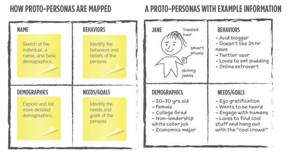
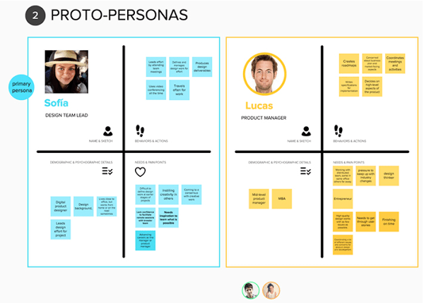
A persona is a description of an archetypical user of a product. It’s a communication tool that helps align development (and other) teams with different types of users.
Personas are a great way to create a common language about users and raise empathy toward them within an Organisation.
A word of caution about personas:.unlike what many people think, personas are not a research methodology. The biggest problem with personas is that, in many cases, they are not based on research but on assumptions, guesses, and beliefs.
It’s perfectly fine to start with an assumption and then validate or invalidate it based on your research. But trusting personas without any research is just wrong.
Given that you already have a pretty good understanding of who your users are from the research steps, you should create proto-personas that represent different user groups of your product. Personas are meant to be realistic and based on actual people.
Proto-personas are lightweight. They are specific enough to drive design intent, but loose enough to keep us curious.
Live and breathe your user personas. We recommend that you keep coming back to personas and update them as new information arrives.
6. Learn from the competition
Competitor research is for idea hunting. We believe that it’s easier to edit ideas than to start from scratch. Identify competitors that are the most relevant, figure out what experiences they are delivering, and determine what you can do to improve those experiences.
You can even try and find users of competitors on social media and community/support forums and interview them to figure out their needs and pain points.
7. Determine your key experiences — and define KPIs
Now that you know what features and user goals are going to be in the product, you can decide on key experiences that will make or break the product for the users. Making a list of these key experiences will help you get focused.
These key experiences can be –
For Facebook it was a user reaching 7 friends within 10 days of signing up.
For Dropbox it was user putting at least one file in one Dropbox folder on one device.
For Trello it was number of boards created and number of cards added. Also, they focused on number of users invited.
After making a key experiences list, you can create KPIs that will help fulfill them. examples include .
- Task success rate — It is the percentage of correctly completed tasks by users.
- User error rate — Errors encountered by users to achieve certain tasks.
- Time spent on a task — It will help you understand where users are getting stuck and what can be done to improve that task.
Break down basic tasks into smaller bits and create three rows for each task: success rate, error rate, and reasons behind unfinished tasks.
8. Don’t reinvent the wheel — use UI kits
Just like it has become easier to develop something with the access of cloud services, APIs, and ready-made SDKs, it has become simpler and easier to design good UIs by following ready-made design systems like Material design and Bootstrap.
This plug-and-play nature of development can lead to good design by using ready-made UI Kits. This will help you roll out good- looking prototypes quickly and you will be taken seriously when you show it to your audience.
9. Use design patterns that already work
UI Kits only give you pretty elements, but what you want to nail are the experiences of design patterns. The idea here is to find design experience patterns that work.
We recommend using sites like Dribbble, Behance, Uplabs, useronboard, mobile-patterns, littlebigdetails and pttrns.
10. Direct and indirect competition research to get inspiration for UX patterns
Indirect competition research is one of my favourite ways to find great UX design examples. You can draw in inspiration from indirect competitors and learn from how they are solving challenges.
For example, let’s say you were developing a marketplace for grooming services where users can find great stylists who provide on-demand services.
The UX challenges here will be finding the right stylists who provide quality services, and booking appointments with them quickly.
You’ll also need to make sure they show up on time and don’t cancel services in the case of advanced booking.
The customer also needs to make sure the services the stylists provide are reputable.
Out of this, let’s take booking appointments as a UX challenge to be solved. You can draw inspiration from different sources like Hoteltonight, Zocdoc, Rover, or Thumbtack.
11. Make it a no-brainer
Reduce barriers — lower the cost of using your app by addressing bugs, usability, and points of confusion.
- Put examples in front of users so all they have to do is browse (Kickstarter, Indiegogo, App Store, etc.)
- Easy access or prominent locations (Amazon one-click)
- Pre-populate data (name at least!) and autocomplete (e.g. Address Autocomplete)
- Allow them to click or tap instead of type (e.g., social logins)
- Allow users to talk instead of type (this is quite popular for Chinese people because typing takes forever. You can see this in action on Google audio search and Facebook audio messages)
- Reduce clicks required for workflows
- Give users the option to use OAuth
- Offer free trials and no credit card requirements
- Speed everything up — one of Google’s philosophies
- Make a script for them (Wave Accounting pulls your bank data, also see pre-made tweets)
- Localise by supporting their language
12. Build a “gotta-have-it” value proposition
A strong value proposition is the foundation of great design.
With any relationship, it’s important to start the conversation right. If you don’t capture your audience’s attention within the first few seconds, you’ve lost them.
Creating a clear value proposition is hard, but if you get it right there’ll be a clarity and focus to your message that will help to set you apart from the competition
13. Embrace microcopy
How many times have you encountered an error message that doesn’t explain anything? These things don’t happen because no one involved gave it a thought. They happen because it was on no one’s to-do list.
Microcopy is what you would expect it to mean: small pieces of copy. Specifically though, microcopy is the small chunks of text within your product.
Examples of microcopy are:
- Error messages
- Instructions
- Onboarding text
- Payment instructions
- Security notes
- Terms and conditions, etc.
Design is all about solving communication challenges in a simple, effective manner, and words are the backbone of any interface design.
That is why writing content that gives your product a personality and improves experience is critical for designing delightful experiences. Microcopy helps define the brand experiences and set expectations for users.
When done right, effective microcopy increases conversions, delights users and improves the rate of task completion. It can also save time and resources, showcase an organisation’s culture and build trust with users, allowing the organisation to distinguish itself from competitors.
Aim for crisp and unmistakable copy that guides the user in the right direction while also assuring them that it’s going to be all right. Also make the user smile from time to time, without talking down to them.
Good Microcopy:
Is clear
Crisp copy guides users in the right direction and leaves no room for misinterpretation or confusion.
Is helpful
Think of your product or your service as an assistant that is always ready to help. Now, design your copy and experiences around this personality and you will be able to craft copy that always guides users and helps them achieve their goals.
Has personality
Taking our metaphor forward, imagine the assistant with a great personality who smiles and has fun with users from time to time without getting frustrated or talking down to users. This personality can be conveyed by smart microcopy and designs.
14. Make forms efficient
Filling out forms isn’t a thing that anyone likes to do. It is merely a thing we have to do to get things done. Let’s not focus on making it fun, let’s focus on making it usable and quick to fill.
Design for responsive forms.
Borrow principles from mobile forms and try to make them as minimal as possible. As Shakespeare says, “Brevity is the soul of wit.” This sentiment is also true when it comes to building forms: the simpler the better.
When it comes to being visually appealing (and UX-friendly), mobile forms can’t be beat. They’re easier to use, cleaner in design, and faster than their online counterparts.
Not all form actions are equal
- Reset, Cancel, & Go Back are secondary actions: rarely need to be used (if at all)
- Save, Continue, & Submit are primary actions: directly responsible for form completion
- The visual presentation of actions should match their importance
Use proper controls when designing forms.
When users need to make small adjustments to values by increasing or decreasing them, avoid free form input and dropdowns. Steppers help in minimizing mistakes and reduce the number of taps for getting the values right.
Work your way from a monotone, dropdown-heavy form to an easily scannable page by switching controls. Consider using sliders for selecting one or multiple values in a range.
A dropdown with two options like “Show” and “Hide” can be turned into a checkbox. As seen before with the dropdown, you are forcing additional interactions on the user. The same action can be modeled with a checkbox or a switch, a great implementation of a binary choice.
Only ask what’s required and explain reasons behind asking information
In the age of privacy, explaining why you need data is critical.
Make sure you only ask what you really need. Every extra field you add to a form will affect its conversion rate. That’s why you should always question why and how the information you request from your users is being used.
Order the form logically
Consider the user journey and KPIs when designing forms. Details should be asked logically from a user’s perspective, not the application or database logic. For example, it’s unusual to ask for someone’s address before their name.
Group related information
You should group related information in logical blocks or sets. The flow from one set of questions to the next will better resemble a conversation. Grouping related fields together also helps users make sense of the information that they must fill in.
Don’t give error messages
Error messages confuse users and they don’t provide any help on how to resolve them easily. Have you ever experienced filling out a form and encountering an error at the top of the form where you have to scroll up to find out what the issue is and it doesn’t give proper information? Imagine what these must do to non-tech users.
To solve this, I suggest designing smart form validations. Form validation with smart microcopy will be like having conversations with users and guide them through the difficult times of errors and uncertainty. The output of this process is emotional rather than technical.
The primary principle of good form validation is this: “Talk to the user! Tell when them what is wrong!” Generally speaking there are four important elements that good form validation consists of:
- Right time of informing about errors (or success)
- Right place for validation output
- Right color for the message
- Clear language for your message
And all these moments have one major goal — avoid confusion.
Autofill information
Some fields must be filled in to complete the transaction: if you’re selling a physical good, you’ll obviously need a shipping address. You can autofill information like state, city, and zip code by their IP address.
If I am an existing user, then things like name, address, and credit card information should be autofilled quickly. Similarly there will be many details that can be autofilled based on users behavior and past history.
Make form fields format-independent
- Enable flexible data input
- Enable smart defaults
Few things confuse users as often as requiring information in a specific format. Format requirements for information like telephone number fields are particularly common. There are many ways these numbers can be represented:
- (800) 555–1212
- 800–555–1212
- 800.555.1212
- 800 555 1212
15. As the saying goes, ‘fake it till you make it.’
When you launch and your product or service has empty data and no content, then that means the experience that you want to provide to your users is not this one.
It’s a disaster and the entire exercise until now becomes meaningless.
This is a bit of a grey-hat tactic from the marketing world, but it’s a great hack to have and has a direct effect on the experience that your product or service will provide to your users.
We all love social proof and like to use things and get influenced by people we respect or think are similar.
“Fake it till you make it” experiences are those examples that makes it seem like other people also like this product.
Examples include Reddit, Airbnb etc.
Reddit created dozens of fake profiles to show users how to use Reddit.
In the book Paypal Wars, Eric M. Jackson talks about how PayPal grew a base of sellers who accepted PayPal by creating demand for the service among buyers.
When Paypal figured that eBay was their key distribution platform, they came up with an ingenious plan to stimulate demand. They created a bot that bought goods on eBay and then insisted on paying for it using PayPal.
AirBnB allegedly created a bot and fake email addresses that would automatically respond to posts on Craigslist.
Youtube initially hosted pirated content when they had nothing on their site. This led to a massive amount of traffic to their site in their early days.
16. Build fast, keep testing
Finding out if people can use the product is most useful when it’s not ready, when it’s in bad shape, and when you are going to be ashamed to show it to people.
That’s exactly the time you have an opportunity to not only learn about important issues people have with it, but also when you have enough time and resources to fix them.
Building quick prototypes (starting with paper ones) is the perfect way to quickly get feedback from users during usability testing.
There are two ways to do usability testing — qualitative and quantitative.
If your goal is to gather insights from users about different goals (e.g., How can we improve the file sharing process?), choose a qualitative approach.
When you need a clearer answer on what users do (e.g., How successful are people trying to buy a dress using a suggested new product page?), a quantitative approach will do a better job.
In a qualitative approach, you’ll have a few participants and you will see with your own eyes what they do with your product. You’ll notice that patterns will start to emerge with about four to five participants.
In a quantitative approach, you’ll have hundreds or more participants and rather than seeing what they do with your own eyes, you’ll get the numbers that will tell you what happened (hence quantitative).
In summary, a quantitative approach usually explains what happened while a qualitative approach tells you why it happened. So the best you can do is to combine these approaches to get the full picture.
Creating tasks for participants to complete during online usability testing requires attention to details and feedback from others on the team.
There are two critical things to consider when designing a usability test:
- The design should be task-based.
- These tasks should be useful and relevant to the tester.
If you’re designing an on-boarding flow, you have a goal: get the user to complete (at least) one meaningful task in your product. For Twitter, this may be following people the user admires, while for Duolingo this may mean starting your first Spanish lesson.
I recommend two types of usability tests for quick and cheap testing.
- Hallway usability testing
- Online usability testing from tools like usertesting.com and usabilityhub.com
Hallway usability studies
This is just like a usability study above, but more informal — it’s called “hallway” or “corridor” because you find people in the hallway or corridor of your office building and ask them if they have a few minutes for the study.
Online usability testing
Online usability testing is an effective user research technique that carries many benefits like:
- Quick, cheap, and easy: A qualitative online usability test can be completed in 24 hours or less. A quantitative study will last a couple of days.
- Involves real people: It allows the team to observe real people use the product. No more, “We use the product, so we know how usable it is.”
- Provides immediate product usability feedback: Input from participants is clear and immediate.
- Eliminates redundant arguments: The clear feedback coming from real people that are external to the organization helps resolve many team dilemmas, arguments, and slow decision-making processes.
- Eye-opening experience: It instantly tells the team about people’s motivations, perceptions, and behavior.
Tools we recommend
In my opinion, usability testing is not a “nice to have”. It is a must. Essentially what it comes down to is this: you are making a product for someone, so you need to make sure they want and understand it. The sooner you get it in front of real users, the better.
17. Use your data — analytics for startups
Hypothesis testing is at the heart of the Lean methodology. Instead of approaching design decisions with pure instinct and arguments in conference rooms, form a testable statement, define metrics, collect data and draw a conclusion.
We already defined key experiences and KPIs in Step 7.
The KPIs should always be around key tasks user has to perform and you should try to stay away from vanity metrics like task completion rate, on-boarding to conversion rate, task failure rate etc.
To measure these KPIs you should use analytics tools like
Conclusion
Once again I should repeat that building great UX is not a one-time thing.
You will have to develop habits to implement this approach and build culture around this. You can follow all these or only some of them to get the advantages of UX-driven design.
We recommend that you eventually hire a great UX designer who dives deep into understanding your users’ needs and helps your users achieve their goals, but there are the steps you can do to build a great MVP.