The number of mobile phones across the world has increased dramatically throughout the past decade. It is estimated that most users spend around 88% of their time on their mobile phones using apps. In other words, the world’s mobile app screen time consumption is a lot.
This fact comes as no surprise. Apps have the power to make our lives more comfortable, and there’s practically one for every possible thing you can imagine. The downside is that, as competition increases, it becomes harder to make a given app stand out. Not only is it expected for an app to surpass its competitors. It also has to avoid certain mobile app ux design mistakes that might be detrimental to its key metrics like engagement.
Whether you already have an app or are thinking about building one, there is one key concept that will help you engage users and achieve your goals: the User Experience (UX).
What Is Mobile App UX
User experience is the process through which mobile app development teams build meaningful experiences for users through the use of design principles. It is not exclusive to activities associated with software projects, but it plays a crucial role in anything related to it, particularly in what refers to digital product design. Mobile apps, for example, make use of UX principles as key drivers to keep users engaged while delivering an effective solution to a specific problem. An example can help make this clear.
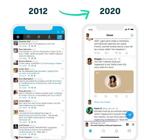
Let’s take a look at Twitter’s app to analyze how its UX has evolved in time. At a glance, one can easily see that the app has completely redesigned its interface. Back in 2012, the main screen of the Twitter app consisted of a number of tweets. This screen, also known as the news feed, is where users could scroll through other users’ tweets. Additionally, this screen gave users the possibility to navigate through other important menus of the app. The emphasis, however, was on users’ tweets. Elements like how long ago it was published, the name of the user, and features like retweet or star were at the front.
Now, after 2020, Twitter’s app has taken a different direction in terms of its UX. In order to stay relevant to its users and build engaging experiences, the app now focuses on different aspects. For a start, it reduces the number of tweets being displayed on the news feed, giving each individual tweet greater protagonism. Also, the fact that new types of content can be shared on the app, has helped the Twitter app insert new features; recently, stories were added to the app, probably as the result of the need to stay in touch with competitors. Another aspect to highlight is that the app is now more focused on user interactions. For example, the button to create a tweet is now more prominent, gaining more attention from users while at the same time making it easier for them to engage with one of the app’s main features. Something similar occurs with other features like commenting, retweeting, and liking.
By doing so, the Twitter app has not only improved its UX. It has helped users stay connected with the app through important design decisions. In the long term, thanks to decisions like this, the Twitter app will be better suited to solve the specific problems that arise as the market evolves.
Each app is unique, and so is its UX. However, the same UX criteria used by Twitter can help your app become more engaging to users. Nonetheless, remember that applying UX principles to your app is no minor thing. Getting its UX right means you will be able to engage with your users at a deep level.
Why Mobile App UX Design Matters
The previous example portrays how an app evolves when it focuses on building powerful UX elements. Having a mobile app built around UX principles isn’t just about designing things to look pretty so that users are happy. It is, at its core, a strategic business decision.
To put it succinctly, UX is important because it helps reduce pain points for users. By eliminating frictions, it is possible to retain users; many mobile apps are deleted because users find them too complicated or hard to use. This translates into better KPIs, and in general, impacts your ROI.

Although for many companies the idea of mobile app UX might seem like something nice to have, in reality, it should be a top priority. Unfortunately, not all companies have the teams or the resources to do so. But fear not, because even if that’s your case, there is still a lot you can do to improve your app’s UX.
6 Common Mobile App UX Design Mistakes
In an ideal world, any mobile app development team should have some UX experts involved. In reality, that is not always the case. Some companies are not believers in the power of UX or they just have other priorities. Whatever the case is, there are some simple things that can be done to improve an app’s UX. Hopefully, you will keep them in mind.
These are some of the mistakes to avoid when it comes to UX:
1. Getting Your Audience Wrong
Getting your mobile app’s audience wrong sounds like a silly mistake, but it happens quite often. Development teams sometimes build a product with a specific audience in mind, just to find out that their target audience is totally different. It is important that development decisions are integrated with other business strategic decisions.
If it occurs to you that your app focuses on the wrong audience, there’s no need to panic. Don’t feel you’ve done something irreversible. What you want is to be able to identify your mistake and iterate as soon as you can towards what is best for your users. By iterating multiple times, you will be able to target the right users with the UX they need, not the one you feel is right for your app.
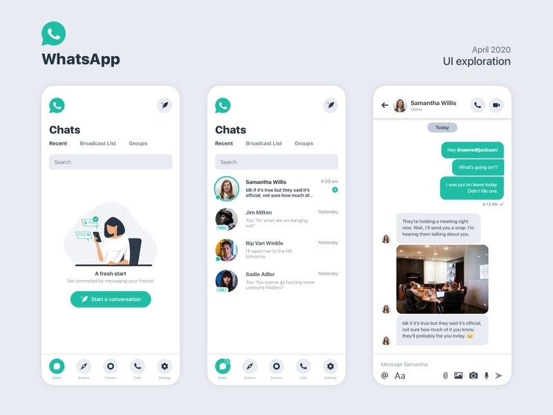
A great example of how to get your audience right is WhatsApp. Initially, the app had a limited number of features. Yet, as it has grown and more users have adopted it as their de facto messaging app, its audience has expanded to include a broader age range of users. As a result, the app has incorporated features that help serve better those new users like voice notes and bigger font sizes for messages, helping improve its accessibility throughout its entire user base.
Validating hypotheses like who your user personas are and what your audience likes is essential. Don’t fall into the trap of thinking that you know your users. You can only get to know them if you go out and test your app.
2. Failing to Understand Your Customers’ Journey
Failing to get your audience right isn’t the only common mistake you’ll encounter when building a mobile app. More often than not, you will also fail to get your customer journey right. In short, a customer journey encompasses the way your users interact with your product. By mapping it, you can potentially identify pain points and reduce frictions throughout your app.
Companies that do not have a clear customer journey lack important data on which to make key design and business decisions. It is important to keep track of key elements within your app. By identifying them, and by testing different alternatives, you will be able to find out what decisions work best for users.
Thus, the customer journey becomes an invaluable tool that can help you not only improve your overall UX, but also improve the business side of your app. After all, engaged users are the best users.
3. Inadequate Tests or Audits for Mobile App UX Design
There is only one way to know if your app’s UX is right: testing. By performing UX tests, you will be able to assess whether the design decisions you’ve made offer users what they are looking for, even if they don’t know what that is.
Although testing an app’s UX sounds rather easy, when it comes to execution, it can be pretty hard. To do it properly, you don’t need to test many users. Qualitative information does not require the same amount of data as quantitative analyses. The good thing about these types of tests is that you can get a lot of useful information by interviewing a few users. By testing your product with four or five users, you will be able to gather some useful qualitative insights to identify pain points and implement improvements.
A great way to test your app is through a design audit. This exercise helps you test, through UX heuristics, whether your product meets a minimum criteria.
4. Communicating Your Brand Inadequately
The idea of communicating your brand through a mobile app does not seem like a priority. With all the things to keep in mind, like assuring quality, configuring the cloud, or getting your code right, it seems that your brand is not so important. However, keep in mind that how your users perceive your product is very important. You don’t just want it to be cool, you also want to communicate its value proposition properly.

A brand is more than the design of your app. It is also what you think your app does, and more importantly, why you do it. By keeping your eyes on central elements of your endeavor like why you do it, how you do it, and for what purpose, you will be able to communicate your brand clearly. In the long term, your brand is something that users will learn to love, so pay attention to what you communicate to them.
A brand can be used as a way to communicate with your audience. By listening to your users, you can understand what their needs are. This brand-driven communication and innovation process allows for friction-less app design decisions.
5. Following Trends Instead of Setting Them in Mobile App UX Design
This is probably the most common mistake that designers make, particularly because it is easy to imitate what others are doing. Not that there’s anything wrong with imitating what others do; after all, we can’t just all innovate all the time. Nonetheless, there comes a time when you should be able to stand out and deliver users something unique that nobody else can offer.
The main challenge with this lies in identifying what that something unique is. Even experienced companies have difficulties answering this question. The best way to avoid falling in this situation requires your app to develop a personality of its own.
Try to avoid focusing too much on what others do and start paying attention to what your users want and what you are able to deliver to them that nobody else can. Before you know it, others will be trying to imitate you.
6. Poor UX Writing
Copywriting is something that many app development teams dismiss as secondary, but the texts you use inside your app are very important. They communicate a great deal of information about how your app works. Most importantly, they say to your users that you care about them by making their experience easy to use.
Your app’s texts are not exempt from UX principles, because what you say is just as important as how you say it. Great mobile app texts make it easy for users to understand what they need to do (in case there is a call to action), or when something goes wrong (in which case you want to offer a solution). A great piece of text might go unnoticed, but a poor one can make your user’s lives miserable.
It is important to have experte UX writers in your team, as designers sometimes fail to address these specific issues. Great apps consider even the tiniest aspects to ensure an engaging UX.
Wrapping It Up
Getting your mobile app’s UX right is necessary if you want to survive the fierce competition out there. Many apps fail to succeed, so if you want to avoid being just another one on the list, make sure to understand what the most common mistakes are when it comes to UX. By doing so, you will be able to connect with your users at a deep level, and few things are as powerful as this.

Diego Coronado
Diego Coronado is the Director of Product Design at Koombea, an app development company that specializes in web and mobile app development and design services. Diego firmly believes UX has the power to help you build amazing mobile apps that users love.