Philosophically, an “empty state” might sound ghastly to someone outside of mobile design. Anyone from the industry will recognise the term for what it is, however, and will have some ideas around how to bump up UX through how empty states are built.
What is an empty state then, if not a terminal floating in the silent ether of the cosmos?
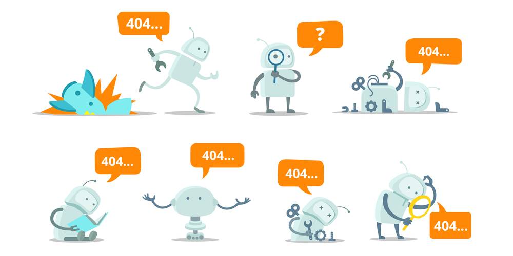
Empty states are those moments in the user experience when there isn’t anything to display, for example while establishing a social media account where you have no connections yet. It might be the final screen of a completed to-do list app, a Slack error screen when a command is not supported – or similarly Microsoft Teams – or a new screen in Dropbox when a user hasn’t created folders or files yet. For anyone on Gmail, when searching for something and getting zero results returned – that’s an empty state. Even the familiar unexpected connection errors from e-commerce sites are empty states.
Unlocking the benefits inherent to blank states takes some imagination. These are moments of opportunity when – if designers correctly imagine just how disproportionately large a part empty states are in the user’s experience – they can substantially boost UX.
On that point, it’s true to say that the user response to mute or otherwise unedifying empty states hasn’t evolved – it’s still (mostly) an irrational frustration. Therein lies a nudge towards the importance of utilising empty states in a manner that always avoids those annoyingly blank moments. Ask any busy IT crew like Computers In The City how often support calls have an added pique due to an empty state bringing a user to their wit’s end, and it will become apparent how important it is for designers to optimise them.
Why is it important to skillfully design an empty state?
User responses are often irrational, it’s true – but great designers will give users the best possible experience in those moments.
If users are surprisingly short-tempered in an empty state of UI, on the plus side, they’re equally as responsive to efforts on the part of designers to improve their experience in those moments. The benefits of tight empty state design start with blank states being great opportunities to communicate. You know how they got there and what they should do – but they often don’t. A nudge in the form of a soft call to action or other option is so much more than nothing.
Helping users backpedal or push forward in an empty moment is helping them work with your product, indeed encouraging them to do so. Applying your mind to empty state design can also significantly increase user uptake, it makes fans out of users, and it limits user churn – decent returns for simply designing an intelligent or otherwise useful empty state screen.
When it’s so easy to become consumed by the genius of the app or platform as the designer – and legitimately so – never forget that you can’t ever leave the user lost and frustrated. You must assume a low basic navigation skill or even general understanding. The best empty state designs never leave users alone, feeling dumb.
Types of empty states
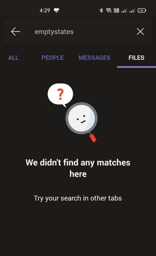
Empty states occur under a variety of conditions, typically known and recognised by their epithet: First use, User cleared, Error, and the No results/data screen we all know so well.
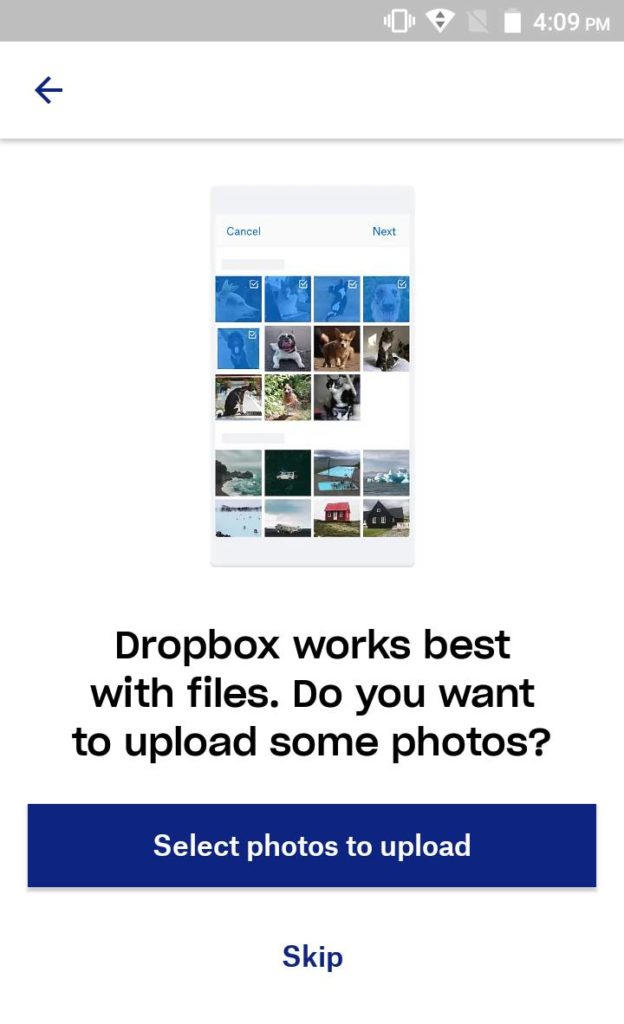
Looking at the first case of First use, Dropbox provides a classic example.
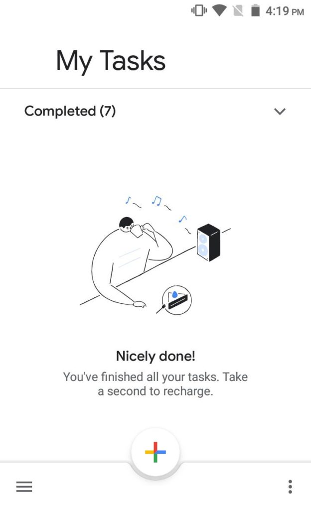
The second empty state of User cleared is best illustrated with a classic snapshot from Google Tasks, where a user has ticked off their tasks, resulting in a screen confirmation of completion.
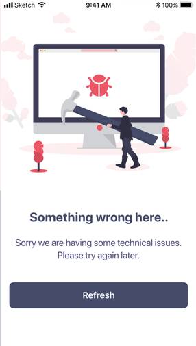
Unexpected errors happen daily to most users, with connection errors being the most prolific. The screen notification constitutes an empty state, as seen below.
Microsoft Teams provides a classic example of a No results/data empty state, something many users will recognise as part and parcel of their working day.
With personalisation being such a compelling demand from users, great empty state design can add what feels like a personal touch. It’s not as simple as it sounds – fun mustn’t become silly or corny, serious shouldn’t become pedantic, and a dynamic approach shouldn’t present as self-important; but good empty state design encourages onboarding and generates trust.
Have no doubt about it – as insignificant as an empty state might seem to many people, skillfully rendering those blank states contributes to brand awareness through user contentment in often surprisingly substantial ways.
When it comes down to the bottom line, well designed empty states are a contributing factor to user happiness and, ultimately, market share. Not only do they make for a great customer experience, they are rising in importance as moments of opportunity to keep users engaged and satisfied, in a time when those moments are constantly shrinking.
Best practices for optimising empty states
Previously underrated (or at least ill-defined), empathy is a key component of design per se, and empty states are no exception.
Utilising empty states to improve UX by figuring out how to correctly populate them with the right microcopy can be sublimely rewarding, and successfully generating empathy with users (probably) most rewarding of all. A bit of cheek, some surprise or delight – some genuine statement of emotion or personality, in essence – are good points of departure when seeking to optimise blank states.
First impressions
The first screen that a user interacts with sets their expectations. Useful intel, therefore, will center on how to complete basic tasks and inspire them with the competence to keep using the app. Onboarding is a product of engaging, and any initial experience should make users want to return. First impressions count with empty states.
Empty state design is about less being more, soft but directional nudges, and even a gentle handholding of the user. It might be fairly neutral or take a longer shot at resonating emotionally with users, but whether they know it or not, users rate any attempt at a seamless experience higher – and that definitely includes not making them feel dumped, silly, or simply alone when facing an empty state – than empty states that are mute, terminal, or just otherwise devoid of any interaction.
Biophilia value
Apart from empathetic resonance, applying the known biophilia value of nature imagery also has a home in empty state design. This value states that improved concentration and reduced stress in people result from views of nature. Helpful hints geared for the user are another empty state option – not too much overload, not singing the praises of the app, and definitely not a list of FAQs copied from the website. If a FAQ or two are employed in an empty state, it’s better to present the information as a statement and allow for a roll-on to an exit or further step. Here, simplicity and intuition are imperative – light but succinct touches define great empty state design.
One great example of good blank state design comes from Instagram. Without followers and following no one, new users could easily get sucked into app features that divert them from the core platform function. Suggesting that new users view people to follow, or start adding people they’re keen on following, keeps users engaged, softly reinforces what people are supposed to do there, and builds confidence with the app.
Modern empty state design is typically part instruction and part user delight. Step the user through their excitement at using the app by presenting instruction in such a way that it almost appears as though they knew how to do it anyway.
That is a triumph of empty state design.
Don’t leave empty states truly empty
If there’s a dictum that encapsulates great empty state design, it’s this: Never let users feel alone.
Designers need to be clear about what empty state screens look like to users, and clear about pointing users to a next step. Empty states need to self-identify – they need to convey what they are to the user, explain why users are encountering the screen, and what they should do next.
Again, it’s easy to insist that users either appear immediately educated when onboarding or refrain from bleating like lost sheep when faced with empty states, but that’s not how it works in reality. The designers who intuitively help users along even the simplest steps are those whose apps outshine the rest. Yes, that uptake hinges on the core value of the app, its function, and even the gratification it gives, but empty states are intrinsic to the user experience in all of that, and remain a disproportionately valuable area of focus for savvy designers.
Take advantage of empty state design to improve UX
Empty state design needs to recognise that:
- empty states aren’t truly empty, and
- they don’t need to stay that way.
Empty states are like conjunctions in language – if you use them to converse with the user and direct their behaviour accordingly, they’ll thank you for it.
Cementing a relationship between user and product is where empty states truly come into their own and shine. Design them to allow a seamless experience for users – without compromising their functionality – and everything will be that much smoother and smarter for all parties involved.

Zak Gottlieb
Zak Gottlieb is the Business Development Manager for Computers In The City, a London-based IT support organization focusing on small and medium-sized businesses. Zak is distinguished by his passion for business, his focus on collaborative team-building, and his commitment to excellence.